How to Design an Email Signature
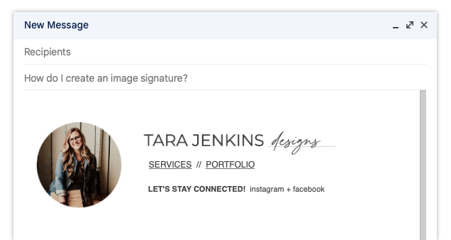
An email signature helps everyone in your organization maintain a polished and professional look that solidifies your brand. It seems complicated though right? It’s easier than you think and if you are my client, then you have everything you need to build an email signature just like mine!
I build my email signatures in Google Docs but you can also use Microsoft Word. It helps to sketch your idea of what you want your email signature to look like (keep in mind both desktop and mobile platforms).
Step one: Build a table to organize your content - mine started with two columns and three rows. I merged all the entire left-hand column to place my photo here.
Step two: Insert your web-size graphics.
Tip 1: png files work best because they are transparent so you won’t see a white framed box around the graphic.
Tip 2: Ideal size for email - no larger than 350 px wide (ask your designer to resize your png logos if they are larger – if she is me, she’s happy to do this for you!)
Tip 3: Link your website from any logos or photos!
Step three: Type out your text.
Tip 1: link important pages to your website and socials.
Tip 2: Be sure to format your text so that it is easy to read and is cohesive with your brand.
Step four: It’s built and looks beautiful, but you will have to remove the borders on your table! Select the table and set the borders to 0 px to remove the lines.
Step five: Select the entire table and copy and paste into your email signature.
Step six: Test it out on both desktop and mobile to make sure everything fits well!


